Playing with Poetry

Illustration from The Pied Piper of Hamelin

Image via Wikipedia

Fridays are Fine Arts Days

when we do our Famous Musician composer study and our Famous Impressionist Artist of the month.  It is also the day we do poetry!

It is a inspiring and fun  activity we all look forward to!

I usually schedule one poem each week.

Sometimes it is one good, long story poem which  the kids soak in …

like …

The Highwayman by Alfred Noyes, which my kids really loved.  We recited some parts with dramatic expression (tried to do it like Ann of Ann of Green Gables).

Illustration from The Pied Piper of Hamelin

Image via Wikipedia

They also loved The Pied Piper of Hamelin by Robert Browning (all XV parts!)

The Listeners by Walter de la Mare was dramatic!  My youngest loved to illustrate this poem!

And every child has to listen to Hiawatha’s Childhood by Henry Wadsworth Longfellow.

And remember how we created Lego diorama for The Lady of Shalot by Lord Alfred Tennyson?

But we often end up covering several short, fun and nonsense poems in one sitting like …

Mr Nobody Anon

Colonel Fazackerley  by Charles Causely

The Owl and The Pussy-Cat by Edward Lear

The famous nonsense poem Jabberwocky by Lewis Carol

We love the play of words and their meanings, the sounds and rhythms of words, the rhymes and the ideas.  These fun and nonsense poems declare,

“You can do this too!”

And that’s how we have done poetry the last while.

We make our own versions of the poems!

We illustrated or painted our poems.

We dramatized the poem and even made finger puppets.

We created a tunnel book pictures of The Door by Miroslav Holub.

We each created our own versions of Cardinal Ideograms by May Swenson.

Not only did my 11-year-old-I-can’t-write-poems child write extremely clever concepts for each number shape, but she wrote them all about her beloved cat!  A Cat Cardinal Ideograms!

My youngest 9-year-old became quiet and thoughtful and came up with these original ideograms:

And, while they were creative, I joined in and created these Ideograms:I’m excited that we are playing with poetry.  I love that we love to play and work with words! I love that we  have moved from reluctant writers to creative poets!  Poetry inspires, and I hope that each child discovers their unique gift with words.

I use a compilation called The Works 7 – Classic Poems for the Literacy Hour by Brian Moses which I bought cheaply at Bargain Books Store.

The other anthology is our Sonlight poetry book, The Oxford Illustrated Book of American Children’s Poems edited by Donald Hall.

Use whatever you have on hand or find at the library and enjoy poetry with your children!

Blessings,

Sketching Something Brown For Sketch Tuesday

What do you think of when I say the word

Brown?

Living on a farm, I can think of lots of brown …

garden soil

deep, dark brown compost

mud

pooh … cow pooh,  sheep pooh …

our beautiful brown Jersey cows with their caramel brown calves…

brown ploughed lands ready for Spring plantings

But we all spontaneously thought of yummy brown things …

Lindt chocolates

layered chocolate cake

chocolate sauce pouring over cakes

hot chocolate drinks with cream …

And here are our sketches:

Miss. L9's delicious brown goodies!

Miss. K11's beautiful dipping chocolate hearts

My dream chocolate treats

We can’t wait for the official Sketch Tuesday to start 6th September!

Blessings,

Learning Phonics the ABACARD® Way!

When I started homeschooling over 12 years ago, I used ABACARD® to teach phonics and early reading.

This system, created by © Shirley Epstein and other teachers and artists,  have designed picture clues within each letter shape.  This concept assists memory of the shape and sound of each letter.

“It works because the clue is contained in  the letter shape!”

When my young children showed signs of reading readiness, I put the wall chart on the wall near their beds.

I simply pointed to and read each letter in its phonic sound and named the picture inside it, such as: “a is for apple“, “b is for ball”  and “c is for colours” (using the phonic sound for each letter and not  “ay/ bee/see…”    Then they repeated the sounds and named the picture clue inside each letter.

Each day I revised the previous letters and continued with the next set.  Within 3 days or so, we had covered the alphabet.  At each bedtime and nap-time, we would run through the chart.

I was delighted to hear my young 4-year-old reading the chart aloud on her own to herself as she lay down for her midday nap after just a few days!

Then I took out our ABACARD® cards.

They come in a nifty hanging plastic holder with clear plastic pockets containing packs of 4 of each letter.  My kids loved the colourful jellytot sweets design on the back of these cards.

We revised the letters and then played games several fun games like “snap”, “memory” and “twin and win”.  The pack comes with a lovely instruction booklet.

Then we started building words with the cards. Taking just the letters p, t, b, g, and the vowels a, e, i, o and u we made the word bag. We swapped a and made beg, then big and bog and bug. Using this principle we made up lots of words – my child WAS READING!

When we moved on to early readers, we used these cards to make up the new vocabulary and played games until these new words were easy to read.

ABACARD® is an excellent tool for remedial work too.  Because each letter has a picture inside it, children are less likely to confuse letters!  It is great for kinesthetic learners because they can handle and move each letter.

Abacard are still busy creating their new website, but they can be contacted at Abacard@telkomsa.net or call them on South Africa 0861 67 22 22 or 083 463 7355

Please note:  I do not distribute, sell or receive any payment for endorsing their product.  

Blessings, Nadene

A Collage of “The Cradle”

The Cradle

Image via Wikipedia

I saved Berthe Morisot’s best for last …

The Cradle

It is said to be her most famous art work.

This is a tender painting of Berthe’s own sister Edma gently contemplating her new baby, painted in 1872.

We had looked at it before during this month and talked about Berthe’s transparent painting of the lace and veils that flow over the cradle.

I felt that this painting was simple enough for a collage.

Once again, I traced an outline of the print from our book, and enlarged it to fill a page.

I dumped out all our bags of scrap materials and lace on our floor and table, as well as some felt off-cuts and balls of wool, and asked the girls to make a collage.

I told them it did not have to be realistic or even represent the painting.  They were free to interpret the collage as they felt was best.

We all made several “mistakes” (I prefer to call them “creative discoveries“) as we went along and we all felt that it would have been better if we had known which areas to collage first.

My youngest child became frustrated trying to trace the outlines on thicker material at times, but we were all engrossed in the activity and felt happy with the results.

So here’s  how to do Berthe’s The Cradle in collage.

  1. Cover all the background areas first; the walls and even the window.  We colored in areas and /or used thin fabric scraps.
  2. We learnt how best to draw the outlines – Start on an edge and align the fabric.  Trace the nearest lines, lifting and looking under it as you go along to see where the line leads.  Cut that line out and place the fabric down carefully and continue along the area, lifting and drawing the lines until the piece is cut to fit.
  3. It is best to use white seamstress chalk or soft white pencil to outline dark material and use an ordinary lead pencil to trace lines on light-colored fabric.
  4. Do the curtains next.  We used 2 and even 3 layers of netting.
  5. I added a split pin/ brad for the curtain tie-back.  I actually draped my curtain around this.  My youngest child  used buttons for her tie-back.
  6. We did the mother’s face and neck and the hand that cups her chin next.  I had to remove her hand that rests on the cradle to place the blankets under the hand, so leave her hand until you have done the cradle.
  7. Next we added her dress and lace at the cuffs and neckline.  We found it looked best to cut out the sleeves separately.
  8. Now we added her hair.  We wound wool around 2 fingers and then spread these loops to form her hairstyle.
  9. Next, we covered the cradle inside and the behind veil and fabric that flows over the edge.  We glued the material so that it ruffled and wrinkled.  We used strong clear adhesive glue.
  10. Now for the baby in the cradle.  We first made the cushion.
  11. Then made baby clothes.
  12. We added the top cover or blanket.
  13. Now we glued the baby’s hand and then the head.  We added fine details such as the eyes and mouth with brown felt-tipped pens.
  14. Some added hair.  I used felt-tipped pen to draw hair on mine.
  15. Again I used a split pin/ brad for the brass cradle stand.  We used gold cord for the stand.
  16. We draped several layers of netting over the baby in the cradle.
  17. Lastly we added the mother’s face details.


This project took quite long, about 2 hours, but it was thoroughly engrossing and enjoyable.

I really encourage you to find a way to enjoy your art appreciation lessons and allow your children to engage personally with the masterpiece.  It does NOT mean that you have to do art lessons.

In making this collage we enjoyed a creative process that placed the details of the painting clearly in our hearts and minds.

Blessings,


Tunnel Books Made our Narration 3 Dimensional!

Tunnel books form 3 dimensional pictures made from cut out layers stacked on top of each other, almost like a peep show!

I thought this would be a creative way to illustrate the overcrowded immigrant cities we read about in our Sonlight  American History studies.  (Busy hands while I read aloud …smile)

Here’s a 4 frame tunnel book tutorial:

  • I prepared 4 frames, each one slightly wider than the next.
  • We looked at photographs and pictures to plan each frame.
  • I suggested that the objects become slightly smaller on each frame and that some objects stick out into the inside of the frame. (You’ll notice the sizes decrease in the tunnel book above and really create a sense of depth!)
  • The girls illustrated and cut around the inside details.

    4 frames with 2 concertina strips

  • They placed this frame over the next wider frame and planned where to place their new objects that would stick out.  Objects that joined across the frame looked really good!  They planned new details to show where the top frame would not hide them.  They drew a few pencil lines around these and illustrated the new frame.
  • Once they drew and cut around the 2nd frame, they placed this on the 3rd frame and repeated this on the 4th frame.
  • We did not cut out the middle of 4th frame, but  illustrated the centre as the background of the picture.
  • We folded 2 concertina to have 4 folds each and pasted each page on the folds on both sides.

    Matching each frame to a fold on the concertina

  • Viola!  A 3 dimensional tunnel book!

And it was such a lovely creative project,

and really easy!

Tips:

  • This would be done best on cardboard or stiff paper.  We did ours on plain paper, but it worked well.  It will not be bulky in our notebook folders.
  • Coloured card or paper would be lovely.  We started with black pen outlines and felt that this was detailed enough.
  • Use just 4 layers: one is the front cover and the 4th is the background.  You could add as many as you need.
  • You could make this tunnel book into a card and include narrations or notes inside the card.
  • Moms could make a simple template for younger children to cut and colour and paste into a tunnel book.
  • You need not have 4 frames.  Instead use a front frame, the next 2 layers just make some sides and paste these against a 4 layer which could be a full photo or picture.
  • Be creative and adapt the idea to suit your child’s age or the concepts you want to include in the tunnel book.
  • You could use 4 photocopies of the same picture or photo and layer these on each frame in the same way that people make 3D pictures with the same picture mounted above the previous one.
  • Have fun!

More tunnel book ideas on the net:

at instructables.com,

a fantastic gallery of great tunnel books,

another gallery,

artbookscreativity.org,

a pdf of a zig-zag version,

and this beautiful easy photo tutorial.

I especially loved the map/ globe tunnel book

Could we use this in Geography?  Weather systems, atmospheric layers, soil and rock layers …

Or what about life cycles or ecosystems in Biology and Natural Sciences?

Cell structure? Zoology of a pond? …

Or a scene from a play/ poem/ story?  Characters, scenes, plot?

I’m tickled to think of all the other possibilities …

And you?

Blessings,

More Marvelous Berthe Morisot Art Appreciation

This week we continued our appreciation of Berthe Morisot and studied


Woman Sewing In Her Garden

We had already looked at some of her works in our art book and I had prepared some outline tracings for our lessons.

Here’s your free pdf download: Berthe Morisot Woman Sewing Outline

It was a toss-up between “The Butterfly Catchers”  and “Woman Sewing in her Garden”  the first lesson.  I let the kids chose.  “Butterfly Catchers” won the toss!  So this week we looked forward to really getting into this painting.

The lovely young lady sewing in her garden looked so serene.  Like “The Butterfly Catchers”,  Ms. Morisot’s colour palette was mostly grey and green.  Her paint style seemed very loose and “messy”.  She used a lot of white paint over her underlying colours.

With this in mind, I thought we should use white acrylic paint over our completed water painted pictures.  

But I get ahead of myself.  Let me start at the beginning:

  • First we looked at the work carefully.  I asked the kids to identify details, features, shapes and basic colours in the painting.
  • Then we colour washed the entire background in green.  A colour wash is watery paint spread thinly over the page with a flat, wide bristled brush.  Now we no longer have a “scary” blank white page!
  • With different shades of dark, medium and light greens, some mixed with a tiny bit of black, other greens mixed with white, we dabbed the leaves and plants.  We tried to leave gaps white where we wanted the roses.
  • Then we painted the woman.  She wore a pale pink dress with grey greens on her sleeve.  We painted the shadows on her face, painted her hair and details of her face.  Then we painted her sewing and basket.  Lastly we painted the bench.
  • Once most of the colours dried, we added details like roses, folds of her dress and sewing and highlighted in pure white acrylic paint.  This gave the feel of oil painting and when dabbed on a fairly loose, free way,  it gave the painting its Berthe Morisot feel!

And here are our paintings:

Surprisingly, my 11-year-old’s discussion with me after she completed her work was,

“Please, Mom, don’t put up this painting on our gallery.” (We hang our art on a large cupboard in the kitchen.)

“Why?”  I asked, “Don’t you like it?”

“No.  It isn’t really pretty.”

“Well, that’s fine, darling.  We’ll let it dry and just put it in your note file.”

After the paintings dried, I wanted to punch the holes and looked at the work again and really liked them!  I told Miss. K this and she also reviewed the work and agreed that they were “fine”.

“So does that mean you are happy to put it up in our gallery?” I asked.

“Sure.”

“And on the blog?”  (I always ask my children if I may share their work before I write a post.)

“Yes.  It’s fine.”


What happened? 

Well, the actual painting process was not too hard, but it was not Miss. K’s style.  It left her feeling uncomfortable.  Too messy.  Not enough details and control. 

She needed time to distance herself from the process and the final product.  After a few hours, it didn’t seem as bad as she felt. 

Art is emotional.  Subjective.  Personal.

Often art is difficult.  Often there are challenges and difficulties.  One has to work through new techniques, different mediums, uncomfortable topics or themes … Immature hands can’t always manage the tools of art.  Students in class often want to give up when they can’t “get it right”.  My own children have cried in art lessons.  Sigh. 

But art appreciation is not about the outcome of art work.  One does not have to do any art. 

I try to keep our art appreciation lessons light.  No pressure to perform.

The emphasis of art appreciation is on each person’s internal working and identification with the master’s art. 

May you and your family enjoy your art appreciation lessons.

Blessings,

Painting Telephones for Sketch Tuesday

Here are our colourful paintings of telephones for our own Sketch Tuesday themes …

Telephones by Miss. L9

Telephone by Miss. K11

Telephones by Nadene

We’re  going on with random topics until Sketch Tuesday opens again in September …

Why don’t you join us!  Just do a simple weekly assignment or theme and have fun!

Blessings,
Tracing Outlines of Famous Art Works

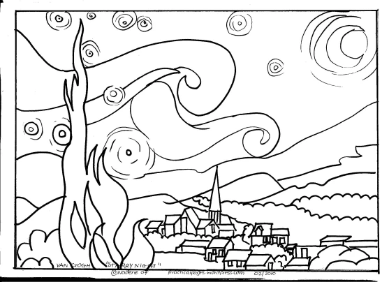
I have often made outline drawings of our art work for art appreciation lessons.  (The Van Gogh picture  “Starry Night”  is one of my most popular downloads!)

Creating an outline is a simple, really easy and frugal method to create an outlined picture which is instantly ready for your child to colour, apply art techniques, experiment with different art mediums, or to make your own version of the art masterpiece.

How to make an outline of a masterpiece tutorial:

  1. You need a tracing pad/ tracing paper (available fairly cheap at stationary or at large department stores) and a photocopiers or printer and prints of art works (postcards, calendars, books, prints).
  2. Select the picture you want to trace.  Size doesn’t really matter.  You can enlarge any small picture on your printer.  If the picture is larger than your tracing paper, just section off the picture and trace each section separately.
  3. Trace the main lines and shapes and outlines with a black pen or fineliner.  (Pencil prints out too faint) You can include major shadows or sketch or paint lines that feature strongly in the painting.)
  4. Draw a frame around the picture and write the artist’s name and the title of the work at the bottom. (I always try give reference and honor to the original artist.)
  5. Place your tracing paper on the printer face down.
  6. Print a copy.  Viola!
  7. Of course, you can enlarge your small tracing to fit the page.  Just experiment with about 120% or more and see if it needs to be made bigger/smaller.
  8. Make several copies for each child or family member.
  9. Have fun on your paper copy!

Why do we use tracings?

  • Create a reference to a famous work and add it to written biographies and narrations.
  • Apply techniques famous artists use
  • Learn to mix colours, do colour washes and paint in layers with details last
  • Make the art work “your own”
  • Focus on the original for clues and details
  • Use the original for some more contemporary art techniques (like a collage/ a mural/ coasters/place mats/ quilt designs/ build a 3D landscape, etc.)
  • Although many adults consider this just “colouring in”,  I encourage them to give it a try!  It is MUCH more difficult than it seems! 🙂

Hope this helps you create fun and easy art appreciation lessons for your family!

Pop over to my Art Page for all my other art appreciation lessons, free downloads and Charlotte Mason Fine Arts ideas.

Update:  I found an easy tutorial at quotidianmoments.blogspot where Willa shares how to make coloring  pages tutorial using Picnik

Blessings, Nadene

July Sketch Tuesday Art

We’re back to school after our July winter break.  My kids loved their free days around the farm and time for creative beading, reading, baking, sewing and crafting.

One of the few constants in our home is art and crafts.  We sketched right through the school holidays.  My kids just love Sketch Tuesday themes – they’re simple, yet creative ideas. 

Although Sketch Tuesday is officially closed till September,   I penciled in some Sketch Tuesday themes from Barb’ past slide shows on our calendar and we sketched each week.

Even some friends and visitors joined in.

Here are some of our sketches for our July slide show:

This slideshow requires JavaScript.

Are you still sketching?

Blessings,

Impressed with Berthe Morisot’s “The Butterfly Catchers”

Our Famous Impressionist Artists we started this month is ~

Berthe Morisot

My girls were delighted to study a female artist who became a committed and successful artist.

Bertha married Eugene (Edouard Manet’s brother, another famous Impressionist artist) and they had a daughter.  She regularly exhibited her art in the Impressionist exhibitions.  Her works often portrayed women and children and simple domestic scenes.  Her most famous painting is “The Cradle”.

We were happy to read that she managed to combine a happy family life with her dedicated career.

Charlotte Mason suggested we study 1 artist and their works for a month, and so we will study Berthe Morisot’s  life and art works this month, and focus on one new painting each week.

This week we chose ~

The Butterfly Catchers

http://www.canvaz.com/b/Berthe-Morisot-(1841-1895)/The_Butterfly_Chase_CGF-s.jpg

I first asked my kids study this picture in our book Impressionist Painters quietly for a few minutes. 

I asked them to look for details;

  • what each person was doing,
  • the most prominent colours and shapes,
  • objects’ positions on the page, etc.

They were to make a mental picture to “hang in their mental art galleries”.  (I did not prompt them before with any technical artistic info.)

I closed the book after about 2 minutes.  They wrote as many details as they could remember on the back of their outline page I had prepared.  I was pleasantly surprised at the differences and interpretations they each shared in their narrations. We actually see things differently!

I especially asked them to conclude their narration and write what the picture made them feel.  I wanted their own, personal impressions.  Lovely sentences came out!

I was happy with just this.

But I had traced the outline of the painting and suggested they could paint their own picture of “The Butterfly Catchers” if they wanted to.  They were very keen!  So we took out our paint trays and brushes and we all painted.

We were all surprised at how hard it was to paint in Berthe’s quick, loose style!  Most the colours in the painting were grey and green.

We all started with green colour washes; light green on the grass, dark green in the tree area and light blue for the sky.

It was much harder to keep the details clear.  We all “lost” it at different times, and we had to focus and concentrate on colours and brush strokes to keep it free, but not sloppy.

Here are our paintings:

Miss. L9's painting

Miss. K11's painting

Nadene's painting

All quite similar, but each identified with different aspects of her original painting.

It was a most enjoyable art appreciation lesson.

Enjoy something similar with your artist of the month!

Blessings,